

An in-depth explanation of some interesting optical effects that are totally irrelevant to web design! Includes
Vision
Spectra
Colors
Light
& so much more…
… like this handy-dandy glossary of color-related terms, not all of which are covered in this article:
Chroma
The colourfulness of an area judged as a proportion of the
brightness of a similarly illuminated area that appears to be white
or highly transmitting.
Color
The visual effect that is caused by the spectral composition
of the light emitted, transmitted, or reflected by objects.
Color
Temperature
The temperature, in Kelvin, of a Planckian black body radiator whose
radiation has the same chromaticity coordinates as that of a given stimulus.
Fluorescence
The process whereby colors absorb
radiant power at one wavelength and immediately re-emit it at another
(usually longer) wavelength, as in "day-glo" or black-light
paints.
Hue
The attribute of a visual sensation according to which an area appears
to be similar to one, or to proportion of two, of the unique hues: red,
yellow, green and blue.
Light
A universal and essential attribute of all perceptions and sensations
that are peculiar to the visual system. In other words, an optical radiation
capable of directly causing a visual sensation.
Luminescence
Luminescence
may occur either during or after the absorption of light energy at another
wavelength. Emission which occurs only as long as the exciting input
is being received is specified by the term fluorescence; emission which
continues for some time after the energy input has ceased (as on the
dial of an alarm clock) is said to exhibit 'afterglow' or the attribute
of so-called phosphorescence.
Objects which exhibit the following:
-
They have different spectral reflectance factors (spectral curves).They match under at least one combination of illuminant and observer.They do not match under at least one combination of illuminant and observer.
Metamerism
An effect created when objects having different spectral distributions
look alike under one light source but appear different when viewed with
a dissimilar light source.
Phosphorescence
Light
emission which continues for some time after illumination has ceased
– "glow-in-the-dark" phenomenon.
Specularity
Also specular component or gloss. Reflection as in a mirror without
deviation by scattering, diffraction or diffusion.
Spectrum
Specification of the monochromatic
components of the radiation considered.
Unique
Hue
A perceived hue that cannot be further described by the use of hue names
other than its own; there are four unique hues: red, green, yellow and
blue.
First, some background info
How
color vision
ostensibly works:
All
color is due to light: radiation in the visible portion of the electromagnetic
spectrum. Visible, to us, means the
range of wavelengths that can be processed by the human optics and brain.
The
sensation of an object's color is produced by the combination of:
- A light source - illuminating an object
- An object - reflecting light to an observer
- An observer - sensing the reflected light
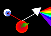 A
simplistic explanation of how color is perceived involves white light,
"a mixture of all the colors of the rainbow", falling on a red
object, which absorbs all the colors except the red portion of the spectrum,
which is reflected back to the viewer.
A
simplistic explanation of how color is perceived involves white light,
"a mixture of all the colors of the rainbow", falling on a red
object, which absorbs all the colors except the red portion of the spectrum,
which is reflected back to the viewer.
How
color perception
really works
Light is radiation emitted by
matter. Solids and liquids radiate energy unless at absolute zero; as
the temperature is raised, their radiation moves up through infrared (perceived
as heat) into the full visible spectrum as white light. Because this radiation
is additive, we see this radiation beginning in the reds at ~ 900°K,
through orange, yellow and ultimately white. Gaseous elements radiate
in characteristic bandwidths; rather than a continuous rainbow, these
emission spectra are discrete, narrow bands of specific colors, enabling
the accurate identification of the elemental composition of distant stars.
![]()
Hydrogen emission spectrum
![]()
Helium emission spectrum
![]()
Carbon emission spectrum
![]()
Oxygen emission spectrum
![]()
Nitrogen emission spectrum
![]()
Neon emission spectrum
When white (full spectrum) light passes through a cloud of gas, the same bandwidths are absorbed rather than emitted, producing gaps in the spectrum that can also serve as identifiers for the gas composition.
![]()
Full spectrum
![]()
Emission spectrum
![]()
Absorption spectrum
The wavelengths of the complete visible spectrum, between infrared and ultraviolet, range from approximately 390 to 750 nm (nanometers, billionths of a meter). Spectral wavelengths are also frequently given in Å (angstroms, 10 nm) or °K (degrees Kelvin). While active upon the human body, infrared and ultraviolet are invisible to the human eye. These are the wavelengths for the traditional visible "seven colors of the rainbow", ROYGBIV:
|
750-650
Red |
640-590
Orange |
580-550
Yellow |
530-490
Green |
480-460
Blue |
450-440
Indigo |
430-390
Violet |
These naming divisions are arbitrary, made by Newton when he used a prism to separate sunlight into its spectral components. Color can additionally be expressed in Kelvin, the temperature in degrees Kelvin of a Planckian radiator emitting at a specific temperature, as described above.
Why
do we think we see a contiuous spectrum?
Because
the human brain and optics "average out" discrete colors of
light. For example, an object emitting or reflecting light in only the
green wavelengths can appear identical in color to an object emitting
or reflecting both yellow and blue wavelengths, but no green. This effect
is immaterial in looking at visuals composed of only emitted light, such
as stars, TV screens or computer monitors, but circumstances are quite
different when viewing reflected light, which is dependent on an external
light source. If all "white" light sources we used encompassed
a complete spectral range, evenly weighted, metamerism,
which is a change in apparent color under different light sources
or observers, could not occur.
And now, what you've all been waiting for!
How
metamerism works:
Did
you ever buy items that matched perfectly in the store and find that they
looked completely different at home? Or have you seen a color change occur
when an object was moved from artificial light to daylight? This effect
is metameric. Metamers are a pair of colors which differ spectrally but
which yield the same or similar tristimulus values
under at least one set of viewing conditions. Tristimulus values are the
amounts of three standard lights, in a given trichromatic system, required
to match the shade considered. The trichromatic
system, which provides an accurate color standard, is used
to measure metamerism by specifying colored lights in terms of tristimulus
values, based on matching colors by additive mixing of three suitably
chosen reference red, green and blue lights.
Metamerism, the situation where two color samples appear to match under one condition but not under another, is the result of differences in object surface composition. The dyes and pigments used to create the color of objects such as textiles, paints and so on, have different spectral reflectance curves. Color perception is a combination of the spectral reflectance of the pigment or of the dye (and its substrate) and the spectral distribution of the light source. The color you see is influenced by the emission spectrum of the source of the light available to be reflected by the object. The most common light sources are fluorescent, incandescent, ultraviolet and sunlight, which have different spectral distributions. Incandescent lighting is generally considered warm compared to cooler fluorescent lighting, famous for sucking the life out of beige. Other colors that are likely to have metameric problems include taupe, mauve, lilac, tan, celadon, gray-blues, and grays. While metamerism is normally a light-source effect, it can also arise from differences in the physiological optic structure of observers, e.g. color-blindness.
How
to Test for Metamerism
There are two basic tests available that are useful for evaluating whether
or not two objects (that match) are metameric.
Visual Test for Metamerism
- Confirm that the objects match, by viewing (in a light booth) under the reference (primary) light source.
- Change the light source to a test source that is significantly different from the reference source.
- If the objects still match, then it is likely that they will match under any source, and are thus probably not metameric. If the objects do not match under the test source, then they are a metameric pair. Repeating this test under a third (different) source (whenever there is a match under the reference and test sources) should be done whenever possible, as there are exceptions to this rule.
Instrumental Test for Metamerism
- Using a spectrophotometer, measure the objects, and confirm that the objects match under a specific illuminant/observer combination.
- Compare their reflectance spectral curves. If the curves differ, and cross each other at least three times, then the objects are metameric.
- Confirm the metamerism and compute its amount, by calculating color differences under different illuminant/observer combinations.
References:
www.tssphoto.com
www.colormatters.com
www.extremetech.com
www.datacolor.com
Slightly more relevant info:
Luminescence
A principal disadvantage of incandescent light sources is the large proportion
of heat generated by them, in order to obtain a relatively small amount
of light. By comparison, so-called luminescent light sources can generate
intense light but with very little generation of heat. Luminescence occurs
in nature in the form of bioluminescence (glow-worms, fire-flies and lightning-bugs),
chemiluminescence (decaying vegetation and marsh gas) and triboluminescence
(as a result of friction).
Since the beginning of the twentieth century, many forms of artificial electroluminescence have become available (to include discharge tubes, neon signs, television and the video display tube). In the common discharge tube, a small quantity of gas or metal-vapour is sealed within a cylindrical glass or quartz tube. When an electrical current is passed or 'discharged' between the electrode ends, a flow of electrons is released which excites the elemental gas (which is most usually mercury vapour) to emit its characteristic spectral wavelengths. (In the high-pressure mercury-vapour lamp these combine optically to produce a bluish-white emission, commonly used in street lighting since 1933.) Other familiar discharge lamps are the yellow low-pressure sodium-vapour and pink high-pressure sodium street-lamp. (Increasing the pressure within the tube will tend to broaden the emission spectra to wavelengths beyond the spectral lines normally associated with each element.) The xenon lamp emits a combination of spectral lines which fuse in the human eye to yield a white closely similar to daylight.
Almost all solid materials capable of luminescence consist of a so-called 'host crystal' activated by an impurity, to which it usually owes its colour appearance. For example, the host crystal zinc sulphide appears yellow if its impurity is manganese, blue if silver, or green if bismuth or copper. Such crystals are stimulated to emit light by forcing an electric current through them. One arrangement utilises luminescent powder 'sandwiched' between glass and a reflective metal plate; an electrical circuit is made complete by placing a sheet of conducting glass over the metal and sealing the edges. Relatively little current is drawn, and the whole flat panel is illuminated. The intensity of the light emitted depends on the magnitude of the current and the colour on the selection of crystals used. The flat, pale turquoise nightlights popular in the 60s are an example.
A particular limitation in the use of the mercury vapor street-lamp is its absence of emission in the red region of the spectrum; in an interior setting, this would cause red objects to appear dark and the human complexion unflattering. A light source which imitates daylight more closely can be obtained by coating the inside of the mercury lamp with a fluorescing powder (commonly an impure calcium halophosphate). The energy emitted by the mercury arc is rich in ultraviolet energy (at 185 and 253 nanometres) and the fluorescence produced in the coating converts the invisible ultraviolet wavelengths to longer wavelengths within the visible range; this extends the lamp's bandwidth into the red, thereby offering a more 'balanced' and useful source of white, interior illumination.
Light emitted artificially from the discharge of static electricity was demonstrated by Otto von Guericke as early as 1683. In 1744 Johann Winkler conducted an experiment in which he produced light by shaking up a vacuum tube filled with mercury. The first modern discharge tube did not appear however until 1856, when Heinrich Geissler experimented with a sealed, low-pressure tube powered by a high-voltage alternating current. Important developments followed from advances made in New York City by Nikola Tesla, competing for an alternative to Edison's new incandescent lamp. The earliest luminescent advertising signs, by McFarland Moore (Newark, New Jersey, 1904) were ultimately developed by Georges Claude in Paris, who manufactured and exhbited his first red neon sign in 1910. (The device was patented in 1915.) The first of the line of modern mercury-vapour lamps was exhibited in Cincinnati, Ohio, in 1935.
Even more relevant info!
True
Web Color
It ahs been claimed that color accuracy is not a problem on the web. That
may very well be true for some, but when a corporate logo turns out green
instead of teal the attitude is quite different. Web color mutations can
be explained by understanding what it takes to create accurate color.
The pivotal player in true web color is profile.
Computer color profiles specifically define how your computer handles
color. In other words, it describes the color display your computer is
capable of generating. If your computer had a profile attached to it right
now, and if I wanted you to read these words in a very specific shade
of banana yellow on a dark chocolate brown, the first thing I would do
is EMBED a color profile into this graphic image. This profile would define
the yellow and browns that I have created in my computer based on the
color profile that was used to create them. Now we have two players, you
and your computer's color profile and me and my colored text's color profile.
All that is needed is the messenger to deliver them. The web browser must
be able to carry these profiles to you. Easy! But not available at this
time.
In spite of the fact that most designers have color management systems
on their machines (and especially those that are built into the Macintosh
systems), in spite of the fact that graphic software such as Photoshop
can embed color profiles in web graphics, the web visitor's profile is
still an unknown and all bets are off. Furthermore, aside from plug-ins
and file formats that are not fully supported, web browsers have limited
capabilities to deliver the information. There are other complex and costly
solutions. For example, if customers are truly dedicated to an online
store, they might take the time to download the software for color accuracy
at that one site, but that's not realistic for most situations. One of
the best temporary solutions is to design all web graphics on computers
that generate the best colors (as a result of fully corrected gamma and
other standards). You can test your computer's color vision at the following
URLs: www.colormatters.com/comput.html#test1
www.colormatters.com/comput.html#test2
Still more metamer info!
Yet
another explanation:
The fundamental reason for metamerism is that color
is perceptual rather than a property of an object. This is because the
cones in your eyes can register the same sensation from an essentially
infinite variety of combinations of different light frequencies. Probably
the easiest way to approach this idea is to consider a simpler, metaphoric
example. Rest a 10-pound weight on your hand. The sensation of pressure
against your hand is identical to the sensation you'll feel if you stack
two 5-pound weights with the same cross section on your hand, or a 4-pound
weight and a 6-pound weight, or five 2-pound weights, or an infinite number
of other combinations. With color, the situation is more complicated,
but the concept is the same.
Still more digressions!
Color
optics
The
human eye detects color through light-sensitive cells called cones. Current
understanding is that the 6 to 7 million cones can be divided into red
cones (64%), green cones (32%), and blue cones (2%) based on measured
response curves.
The three different types of cones, named red, green, and blue for the
portion of the spectrum each type is best at absorbing. They
provide the eye's color sensitivity. The green and red cones are concentrated
in the fovea centralis. The blue cones have the highest sensitivity
and are mostly found outside the fovea, leading to some distinctions in
the eye's blue perception. Yet just these three types of cones let you
see all the colors you can see -- roughly 7 million colors. That's somewhat
less than half the number of colors computers offer for "true color."
Computer systems need the much larger number of colors, because the eye
is more sensitive to changes in some parts of the spectrum than in others,
but computers distribute the steps evenly across the spectrum.
In essence, when you see a color, it's because the three kinds of cones contribute to a sensation that your brain recognizes as a particular color. When you see a frequency of yellow light, say, (as measured by its wavelength), your red, green and blue cones absorb the light in particular proportions. When you see a combination of red and green (as measured by the wavelengths of the light once again), your red, green, and blue cones absorb light in the same proportion, and your visual system once again senses yellow. In fact, there are an infinite number of combinations of light frequencies that will register the same way on your visual system to produce the same sensation -- which is to say, the same color. All of which brings us back to the jacket and pants problem. If the jacket and pants you look at in the store are made from the same bolt of cloth -- which means they are part of the same dye lot -- they will almost certainly both reflect each wavelength of light the same way. Regardless of the light source, then, they will always reflect the same combination of wavelengths, and you'll see them as being the same color regardless of the light source. If they're made from cloth that came from different dye lots, however, odds are that they won't reflect each wavelength of light the same way. The mix of wavelengths they reflect from one light source – the light source in the store – will produce the same color, because the dyes were mixed to look the same under a light source that matches the light source in the store. But because different dye lots usually reflect and absorb different wavelengths differently, it's highly unlikely that the mix of wavelengths they reflect from a different light source will also look the same. Move to a different light source, in short, and the colors won't match. As you might guess, you can run across problems with metameric pairs in all sorts of situations – a set of furniture with fabric from different dye lots, wall paper produced in different runs, paint mixed to match a color from a different brand of paint, and so on. More important, metamerism is something you need to keep very much in mind when dealing with color on a computer system. When you're working hard to match colors of a scanned photo to printed output for example, you need to think in terms of matching the colors in a given light. What matches at home under incandescent light may not match at the office under fluorescent light.
One bothersome complication for anyone trying to match colors is that colors actually change depending on the colors around them. This is an observer effect, or optical illusion. Here's a quick test you can run to prove the point. Find a bright light source, like a bare bulb, and hold your arm out in a thumbs up gesture, with the thumb centered on the light source. You should see little or no detail in the thumb, and may see your thumb only as a silhouette against the light. Then, while still looking at your thumb, slip something opaque between the thumb and light source. Your eye should adjust quickly, and let you see details of your thumb. This change in appearance of a central area in your field of vision because of a change in another area is called simultaneous contrast. It affects not just how much detail you can see, but shades and color as well. Images illustrating this point can be found in the book The Underground Guide to Color Printers, published by Addison-Wesley, and at www.yorku.ca/eye/simcont2.htm. The same color can look very different depending on the surrounding colors, and two very different colors can look the same, given the right interpretation of the colors by your monitor or printer. See www.cs.umb.edu/~ram/courses/color/albers.htm for other examples of this effect.